

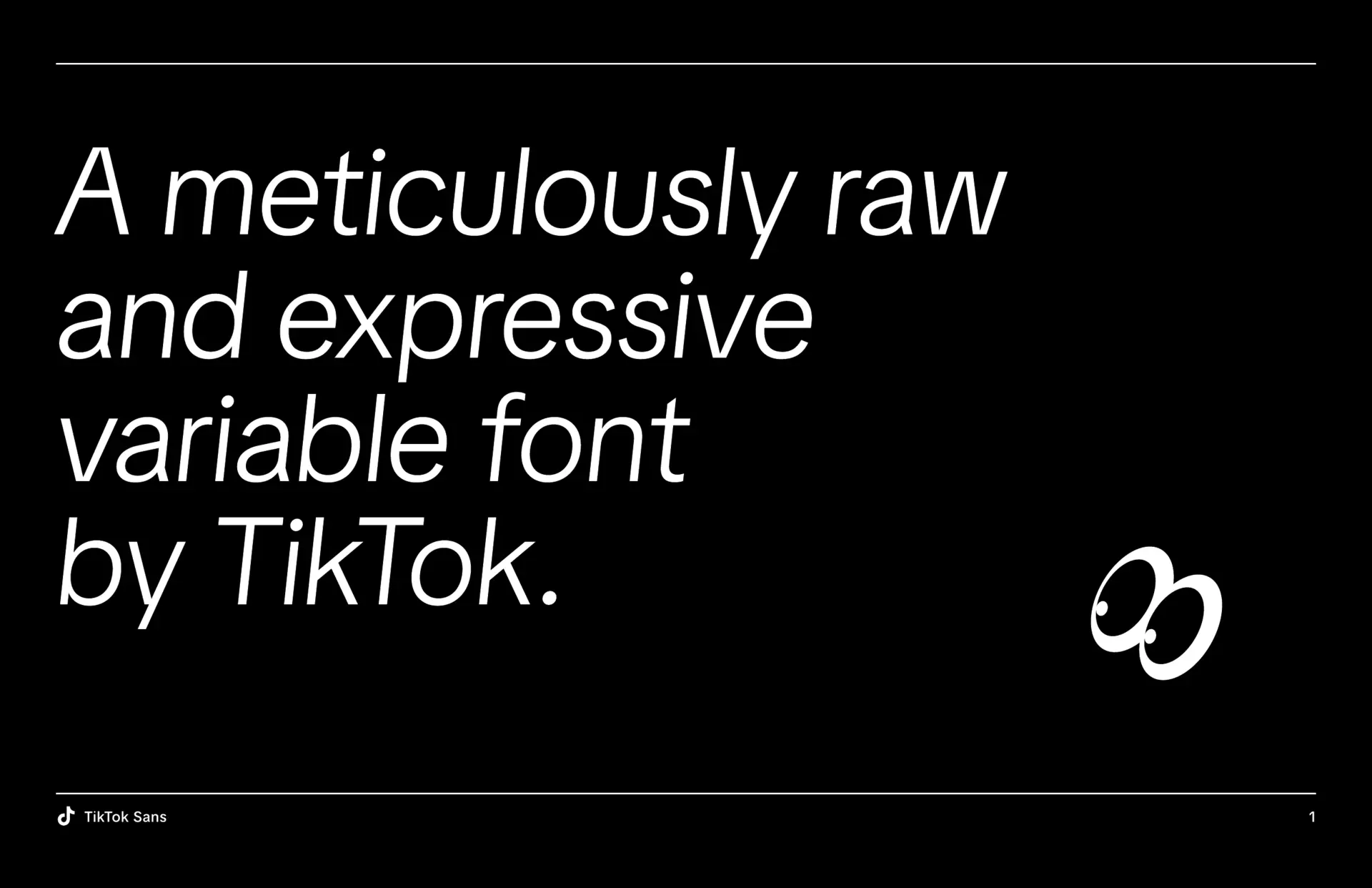
TikTok needed a typographic system that could grow and evolve alongside its fast moving ecosystem, one capable of performing across an ever expanding matrix of surfaces, formats, and cultural contexts. The platform does not live in a single medium. It lives in the intimacy of in app captions, the velocity of short form video overlays, the rigor of data dashboards, the persuasion of advertising products, and the spectacle of global brand campaigns. This demanded a type system that could operate as shared infrastructure rather than a stylistic layer, something equally at home in product UI, web environments, broadcast graphics, creator toolkits, and large scale marketing moments. From the outset, our ambition was to design a typeface that balanced expressive personality with technical reliability, capturing the energy, humor, and authenticity of TikTok’s global creator community while meeting the performance, accessibility, and scalability requirements of a billion user platform. In close collaboration with Grilli Type and partners across Consumer Design, Brand, Engineering, Localization, and Procurement, marketing, engineering, and localization this vision materialized as TikTok Sans, a bespoke type family engineered to serve as the connective tissue of the brand. I worked across departments to shepherd the system from concept through implementation, aligning stakeholders, shaping usage guidelines, and ensuring the typeface could deploy seamlessly from mobile UI to high impact campaigns without losing coherence. Every decision, from character construction to spacing logic to variable axes, was evaluated against real world use cases such as dark mode readability, multilingual support, motion behavior, and low end device rendering. The result was more than a font. It became a foundational component of TikTok’s design language, enabling designers, marketers, and creators alike to communicate with clarity, speed, and a distinctly TikTok voice while reinforcing the platform’s identity as a global engine for storytelling and cultural exchange. What makes TikTok Sans significant is not just its function inside the company but its role in shaping how culture moves through the platform. Typography on TikTok is not passive. It carries humor, irony, emphasis, and identity in captions, memes, and motion graphics that travel across the internet at speed. By creating and ultimately open sourcing the type family, we extended TikTok’s voice beyond the app, giving creators, developers, and educators access to the same expressive system that powers modern digital storytelling.

"Move over Comic Sans, there's a new clown in town: TikTok Sans." - Mashable
Typography sits at the foundation of a brand’s visual identity, and TikTok Sans was envisioned as more than a font. It was conceived as a unifying system that could adapt to the full spectrum of TikTok’s environments, from mobile UI to high-impact brand campaigns. I played a central role in translating the platform’s mission to inspire creativity and bring joy into typographic form. As a consulting Design Lead on the TikTok For Business side, I had the privilege of driving the development and implementation of TikTok’s bespoke typeface, TikTok Sans, created in collaboration with the renowned type foundry Grilli and our consumer facing design team. My responsibilities extended well beyond creative direction. I oversaw the creation and refinement of typographic usage guidelines, built comprehensive design assets, and ensured that the typeface integrated seamlessly into the broader TikTok brand ecosystem. This work was particularly critical for TikTok For Business and global marketing teams, where consistency, clarity, and scalability directly shaped how the brand communicated with partners, advertisers, and creators around the world. Every decision, from character proportions to numeral styling, was designed to enhance legibility and brand distinction while reflecting the energy, diversity, and authenticity of TikTok’s global community. The impact of this work extended to billions of daily interactions. TikTok Sans was engineered to perform equally well in micro-moments and macro-communications. Whether it appeared in captions optimized for dark mode during a late-night scroll, in metrics and view counts rendered with precision and clarity, or in advertising assets designed to resonate with businesses worldwide, the typeface delivered consistency and resonance. By guiding its application across platforms and teams, I helped ensure that TikTok Sans became not only a functional tool but also a cultural amplifier, one that elevated the brand’s presence and solidified its unique voice. I am glad I got to work on such an impactful typography project used across the globe and work with such talented collaborators. I have always been a huge typography nerd, and to be a part of such a large scale font release was truly a joy to take part in and share with the world. TikTok Sans was not a cosmetic refresh. It was a platform consolidation effort that replaced a fragmented typographic stack with a single, owned system designed to scale across product, marketing, and creator ecosystems. Prior to this work, multiple licensed fonts created inconsistencies in tone, performance, and cost across surfaces. By leading the development of a bespoke type platform, I helped unify these touchpoints into a shared visual language that improved legibility, reduced licensing overhead, and enabled teams to ship faster with greater consistency. Through governance frameworks, design tokens, templates, and motion guidelines, we transformed typography from a static asset into operational infrastructure that supports billions of daily interactions.


At TikTok, creativity thrives at the intersection of storytelling, self-expression, and community. With TikTok Sans, our new bespoke typeface, we set out to design a visual voice that reflects the diverse energy of our global creators, visionaries, and storytellers. We engaged and worked closely with Grilli Type to build out and design the typeface that would appear across our app and all future marketing assets. In the launch video I created below you can see a dive into how this typeface helps us reinforce the impact of our creators and users alike in a fresh way across all of our platforms. The launch of this font took a long development process and ushered in a new era for TikTok.
The process of designing TikTok Sans was driven by the need to create a typeface that was both uniquely ownable and functionally versatile across the brand’s ecosystem. The goal was to elevate TikTok’s visual identity while reducing long-term licensing costs by developing a fully custom typeface. TikTok Sans was something that I and many others had brought up throughout the years as a key initative and eventually the idea gathered enough inertia to become a reality. Typography is more than the shape of words; it is the voice of a brand made visible. A custom typeface defines how a company speaks before it ever says anything. It carries tone, rhythm, and emotion across every touchpoint, from a product interface to a billboard in a city street. A brand font creates consistency without rigidity, giving design teams a shared language to express identity at any scale.

At scale, design stops being about artifacts and becomes about authorship of systems that shape how culture is produced, distributed, and understood. My work on TikTok Sans sits at that intersection, where typography is not treated as decoration but as infrastructure for a global creative economy where art is remixed and shared and developed in public by the world just like the content on the For You Page. By helping transform a fragmented typographic landscape into a unified, owned platform that powers product, revenue, and creator expression, I contributed to a shift in how large technology companies operationalize design: not as a service layer, but as a strategic lever that accelerates velocity, strengthens trust, and enables cultural coherence across billions of interactions. This is the frontier of contemporary design practice, where the discipline moves beyond pixels and campaigns into governance, tooling, and open ecosystems that allow communities to build with the same systems that shape the platform itself.
Design was always how I made sense of the world, but typography was where I learned to listen. When I watched Helvetica, it opened a quiet obsession with form and rhythm, with how the smallest decisions could shape what we feel before we even notice it. It taught me to see letters as living structures, each curve and counter a gesture of intention. I spent hours studying how spacing could create harmony or tension, how a single line could shift the tone of an entire composition. Typography became a way to translate thought into structure, emotion into geometry, silence into design. Getting a chance to work on a project like this with Grilli and our consumer side design team was a ton of fun. The work only became real when we treated adoption as the product, not the afterthought.
I operated as the connective tissue between TikTok For Business, brand marketing, and the consumer design org, translating creative intent into requirements that engineering, localization, and procurement could execute against. I helped define the success criteria early, including where the type needed to perform, which legacy fonts we had to replace, and what adoption would look like across teams with very different workflows. I partnered closely with internal stakeholders to align on hierarchy rules, usage patterns, and where we would allow expressive range versus where we needed strict consistency. I built and shipped the practical layer that most font stories skip, the templates, examples, and guidelines that turn a file into a system. I also supported rollout planning, mapping the touch points where the new type could launch visibly without breaking product experiences. The result was a typographic program that was not only aesthetically cohesive but operationally adoptable, which is the real bar at TikTok scale.
Working on TikTok Sans as a collaborator meant operating inside a system of extraordinary scale, where typography was not just an aesthetic exercise but a piece of global product infrastructure. The project required alignment across a wide network of specialists, type designers, engineers, product teams, localization experts, and brand stakeholders, all contributing to a unified system that needed to perform seamlessly across languages, devices, and use cases. My role within that environment was to contribute to a design process that balanced expressive character with functional clarity, ensuring the typeface could live fluidly across UI, motion, marketing, and content without breaking consistency. At this scale, every decision carried weight, from spacing and legibility to how the type behaved in motion and at different sizes, because even small inconsistencies would be amplified across millions of daily interactions. The work demanded precision, documentation, and systems thinking, with rigorous testing and iteration cycles to ensure the type performed under real-world conditions. Collaboration was constant and deeply cross-functional, requiring clear communication and respect for each discipline’s expertise to move the project forward cohesively. It was a reminder that projects of this magnitude are not driven by individual output alone, but by the orchestration of many contributors working within a shared framework. Being part of that process reinforced my ability to operate at the intersection of design, systems, and large-scale product thinking, contributing to a release that needed to meet both creative ambition and global performance standards.

At TikTok scale, typography is not a stylistic choice, it is infrastructure for how culture is read, shared, and understood. TikTok Sans was designed as a system that could carry meaning across billions of captions, dashboards, campaigns, and creator tools without losing clarity or voice. My role was to ensure the typeface functioned as connective tissue, aligning product, marketing, and global teams around a shared visual language that could move at the speed of the platform. This meant treating the font as a living system rather than a static asset, embedding accessibility, localization, and performance into its core so it could serve every market and device with equal integrity. By consolidating fragmented type stacks into a single owned platform, we reduced friction, improved legibility, and enabled teams to ship faster with greater coherence.
More importantly, we established a typographic voice that feels unmistakably TikTok, expressive enough for culture and disciplined enough for scale. In an ecosystem where language evolves in real time, TikTok Sans provides the stability that allows experimentation to thrive without visual chaos. It is the quiet framework behind viral moments, ensuring that humor, data, and storytelling land with the same clarity whether on a phone screen or a global stage. That is the power of design as infrastructure, when the work disappears into use, yet shapes how the world communicates every day. In doing so, the work moved from brand asset to cultural infrastructure, reinforcing TikTok’s position as a content engine where language, design, and community co-create meaning in real time.
As a product and type designer, I approach typography not as decoration but as infrastructure, a system that shapes how information is read, felt, and navigated across an entire product ecosystem. My work sits at the intersection of brand expression and functional performance, where every decision around spacing, weight, rhythm, and hierarchy directly impacts usability at scale. I design type systems that are responsive, multilingual, and accessible, ensuring they perform consistently across devices, surfaces, and contexts while still carrying a distinct voice. This requires deep collaboration with engineering and product teams, translating design intent into production-ready assets, variable font behaviors, and robust implementation guidelines. From early sketches to final QA, the process is iterative and data-informed, balancing craft with real-world constraints. The goal is to create typographic systems that disappear when needed and express when desired, quietly powering the product while elevating the overall experience.

When I think of my own inspirations, Apple’s Think Different campaign introduced me to the quiet power of a font like Adobe Garamond. Those letterforms carried a nostalgia that felt both human and timeless, a reminder that simplicity can hold memory. Nike’s use of Futura Condensed Extra Bold in the Just Do It era became the counterpoint to that stillness. It was urgent and kinetic, a typeface that didn’t ask for attention but commanded it. Between those two worlds I began to understand how typography could hold energy or calm, how it could embody conviction or reflection. Or even like I mentioned above, the first time I watched the Helvetica documentary and it felt like a revelation as a young designer. All these moments cemented that font was important to me, and it was something I wanted to explore as I became a designer in my career.
Furthermore, Susan Kare’s work for the original Macintosh team was also something that had piqued my curiosity in design systems. Her icons showed that design could be both functional and full of personality, that clarity and emotion could coexist in a single pixel. When I arrived at TikTok, that lineage came full circle. To create a typeface for billions of users was to contribute to something larger than branding. It was about building a visual language that could carry humor, creativity, and humanity all at once to help people from different corners of the world connect through our app and our platform. Going from staring at my screen one night at the middle of the night making final tweaks on the kerning and leading and then hitting publish and seeing the same typeface going live to millions of phones simultaneously is an unmatchable feeling.

That belief in craft has a lineage, and one story has always been a north star for me. Steve Jobs’ Stanford commencement story has always stayed with me because it frames design not as a career strategy but as a series of human decisions made under pressure, uncertainty, and conscience. He dropped out of Reed College because he didn’t want to keep spending his working-class parents’ savings on an education he wasn’t fully using, a choice rooted more in integrity than ambition. Yet he didn’t leave learning behind. He stayed on campus, sleeping on floors, returning Coke bottles for food money, and auditing classes that genuinely pulled him in.

One of those classes was calligraphy. Not practical. Not marketable. But the type of thing he had the time to stumble upon serendipitiously without a plan. A deep study of letterforms, spacing, proportion, and the rhythm of text. In the moment, it had no obvious application. A decade later, while building the Macintosh, that fascination became product reality, introducing multiple typefaces, proportional fonts, and typographic richness to personal computing for the first time. That domino is what I think about when I reflect on TikTok Sans. The lesson is simple and enduring: when you care deeply about craft, even when it looks impractical, you are quietly shaping the future tools people will live inside. This is what scale demands when taste meets accountability and you care about what you are building.
The idea that you cannot connect the dots looking forward but only looking backward feels less like motivational wisdom and more like a design law. You follow curiosity, you develop taste, you build sensitivity to form and meaning, and only later do you see how those instincts compound into systems that scale beyond you. Typography has been that recurring signal in my own life, surfacing again and again, from early poster work to brand systems to a global type platform used by billions. Working on TikTok Sans felt like stepping into a lineage that runs from calligraphy rooms to desktop publishing to mobile interfaces to cultural platforms that shape how people communicate. It is humbling to realize that the curves and counters we refine today may become the default texture of how people read, caption, joke, and express themselves tomorrow. The work disappears into everyday use, which is exactly what makes it powerful. That is not surface design. That is cultural infrastructure disguised as utility.
My relationship with type started long before TikTok, in a much smaller and more personal way. Sophomore year of college, when my girlfriend and I went long distance after transferring universities, I built a font from my own handwriting as a gift for her. Distance has a strange way of flattening presence, turning love into scheduled calls and text bubbles, and I wanted to give her something that could live inside her daily routines. If she was typing papers, drafting notes, or writing emails, my letterforms could sit there with her, subtle but constant, like I was beside her in the quiet moments. Turning handwriting into a usable typeface forced me to translate something intimate into something systematic: consistent strokes, spacing logic, punctuation behavior, the invisible rules that make emotion functional. I remember obsessing over whether the “a” felt like me, whether the rhythm of the lines felt natural, whether the imperfections should stay or be refined. It was romantic in a nerdy way, but it was also the first time I understood that typography can carry presence. Looking back, that small project holds the same belief that guided TikTok Sans: a font is a voice you can ship. Whether between two people or a billion, typography is a container for connection, memory, and meaning. A font is only real once people stop noticing it, in many ways the best design is invisible.
.jpg)
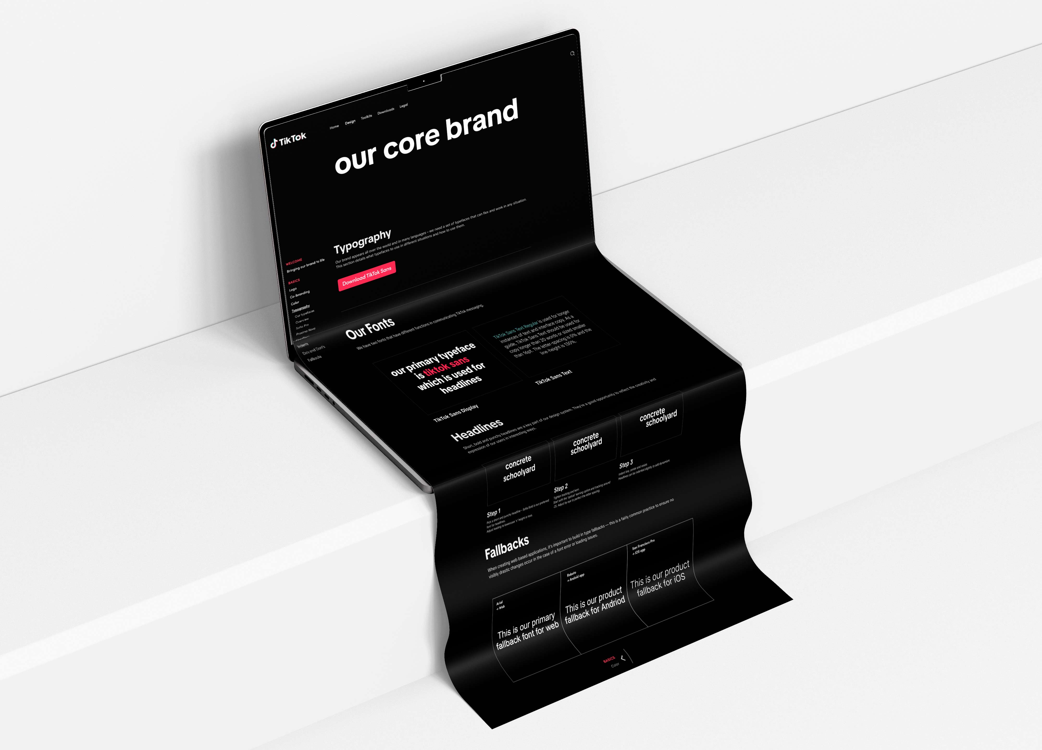
Shipping the family took a long iterative cycle, spanning concept, refinement, engineering, and rollout, where the team designed two symbiotic typefaces: an interface typeface optimized for readability within the app and a display typeface for marketing and branding outside the app and for print with small subtle differences only appreciable at scale or if you know all the use cases. This process also involved redrawing the TikTok logo and subbrands to align seamlessly with the new typography, ensuring brand cohesion across product, content, and communications. Over time we also took direct feedback from our users and expanded the font delivery and eventually released and open sourced it. The right typography unifies motion, layout, and tone, turning information into feeling and repetition into recognition. It anchors the brand’s personality while adapting to the ever-changing contexts of culture and technology, ensuring that every message feels unmistakably part of the same story, and that was our goal here.
The decision to develop a proprietary font stemmed from the growing limitations of relying on licensed typefaces across an expanding ecosystem of surfaces, from mobile UI and web to broadcast, television, and large-scale marketing. While Proxima Nova and Sofia Pro were functional and familiar, they lacked distinctiveness in a landscape where many global brands relied on the same typographic voices. Their ubiquity diluted brand differentiation, and their licensing structures introduced ongoing costs and operational friction as TikTok scaled into new markets, formats, and products. More critically, these fonts were not designed to meet the platform’s evolving technical requirements, including multilingual expansion, dark mode optimization, motion behavior, and low-end device rendering. What began as a practical constraint became a strategic realization: typography was not a stylistic layer but foundational infrastructure that needed to be owned, adaptable, and purpose-built for TikTok’s velocity and scale.
By creating a bespoke type system, TikTok established a distinct, scalable, and cohesive visual language that could unify product, marketing, and creator experiences under a single, recognizable voice. TikTok Sans was engineered to perform across contexts while carrying the platform’s energy, clarity, and cultural fluency into every interaction, from a caption on a phone screen to a billboard in a global capital. Ownership unlocked long-term flexibility, enabling iterative improvements, cost efficiencies, and deeper integration with design tokens, motion systems, and accessibility standards. More than a font, it became a strategic asset and a signal of maturity: a declaration that TikTok was not borrowing its voice but defining it. In future-proofing the brand, we built a typographic foundation capable of evolving alongside culture itself, ensuring that wherever TikTok speaks, it does so with confidence, coherence, and unmistakable identity.
Before TikTok Sans, typography inside TikTok functioned like borrowed scaffolding: multiple licensed families, inconsistent behavior across product and marketing surfaces, and a growing tax on speed, coherence, and cost as the company expanded into more formats, regions, and devices. The real job was not to design a nice set of letterforms, it was to orchestrate a systems level migration from fragmentation to a single, owned typographic platform that teams could trust in the wild. My role sat in that seam between taste and operations: translating brand intent into requirements, pressure testing prototypes against real UI and revenue use cases, building governance and guidelines that made adoption achievable, and aligning design, engineering, localization, legal, and procurement around one shared definition of “done.” The breakthrough was when the type stopped being a concept and became infrastructure: tokenized, documented, implemented, and repeatable across templates, motion, dashboards, and campaign toolkits, so the brand could finally speak with one voice while shipping faster and with fewer exceptions.

Owning TikTok Sans created leverage, because typography stopped being a dependency and became an asset the company could evolve on its own timeline. Consolidating away from a fragmented licensed stack reduced long term licensing exposure and removed the inconsistency tax that shows up when multiple teams ship work in parallel. It also improved speed, because once a font is systemized, teams stop debating basics and start focusing on message and craft. In revenue contexts, clarity is conversion, and a more disciplined typographic hierarchy improved readability in product marketing, sales materials, and performance storytelling where the details matter.
Developing TikTok Sans was not a linear design task, it was a multi-phase product build that unfolded over months of iteration, alignment, and refinement across disciplines. What begins as a typographic concept quickly expands into a system that must perform across thousands of use cases, from UI legibility at small sizes to expressive motion in brand campaigns. Each phase involved tight collaboration between brand, product, engineering, and localization teams, with continuous feedback loops shaping everything from character proportions and spacing to multilingual support and accessibility standards. The process demanded rigorous quality control, testing across devices, environments, and content formats to ensure consistency at global scale. As the font matured, it evolved into a flexible system with multiple weights, styles, and optical considerations, capable of supporting both functional interfaces and high-impact storytelling. Expansion was not an afterthought, it was built into the roadmap, anticipating future needs across regions, languages, and emerging surfaces. What seems like a simple typeface on the surface is, in reality, the result of a deeply orchestrated effort, balancing craft, performance, and brand expression at scale.
On product-adjacent surfaces like dashboards, analytics panels, and measurement tools, TikTok Sans introduced a level of typographic precision that fundamentally improved how information is read and processed at speed. Numeral behavior was re-engineered with tabular alignment, optical balancing, and spacing logic that made dense data sets feel structured rather than overwhelming, allowing metrics to be compared, scanned, and understood in real time without friction. This extended far beyond Western numerals into a full spectrum of glyph systems, supporting thousands of characters across Latin, Cyrillic, Greek, Arabic, Devanagari, Thai, Vietnamese, and key CJK considerations, each carefully tuned for legibility at multiple sizes and weights. Every curve, counter, and stroke had to perform consistently across interfaces ranging from mobile screens to large-format presentations, which meant designing not just a typeface, but a resilient system that could handle linguistic nuance, technical constraints, and cultural context simultaneously. The result was a unified reading experience where clarity was not incidental, it was engineered into every character.
At the brand level, the impact of TikTok Sans operates more subtly but even more powerfully. When the same typographic voice appears across product UI, marketing, creator tools, and global campaigns, it creates a continuous thread of recognition that users may not consciously notice but deeply internalize. That familiarity builds trust, and trust builds habit. What makes a system like this extraordinary is the scale of coordination required to bring it to life, spanning designers, typographers, engineers, localization experts, and QA teams working across multiple phases of development, iteration, and deployment. Each glyph set had to be tested across languages, weights, and rendering environments, ensuring consistency from a caption in Jakarta to a dashboard in New York. This is the kind of foundational investment that rarely announces itself, yet compounds relentlessly over time, because it elevates every surface, every interaction, and every piece of communication that follows.
I led TikTok Sans as a cross functional systems initiative, operating at the seam between Brand, Product, and Revenue to translate TikTok’s creator first ethos into a production ready typographic platform. As a consulting Design Lead on the TikTok for Business side, I partnered with Grilli Type and our internal consumer and marketing design teams to define the strategic brief, steer design intent, and pressure test the typeface against real world constraints across UI, ad products, and global campaigns. My scope extended well beyond visual direction. I authored usage governance, built modular asset libraries, aligned stakeholders across design, engineering, procurement, legal, and localization, and established implementation patterns that allowed the type system to deploy cleanly from in app surfaces to high impact OOH without fragmentation. I treated the font as infrastructure, not ornament, ensuring tokenization, template logic, and motion behavior were codified so teams could execute at speed while maintaining brand integrity.
The rollout of TikTok Sans delivered measurable brand cohesion and operational efficiency at global scale. By consolidating previously fragmented type stacks into a single owned system, we reduced licensing overhead, eliminated cross surface inconsistencies, and improved legibility and performance in mobile first contexts including dark mode, data dense dashboards, and low end device rendering. The system accelerated production velocity by equipping internal teams, partners, and creators with a shared typographic toolkit that behaves predictably across motion, layout, and templated workflows, unlocking faster campaign turnarounds and more consistent storytelling. Open sourcing the family extended its impact beyond TikTok, transforming a proprietary asset into cultural infrastructure that reinforces the platform’s position as a content engine and global storytelling layer. At a billion user scale, TikTok Sans enables the brand to speak with one coherent, expressive voice while empowering creators to do the same.
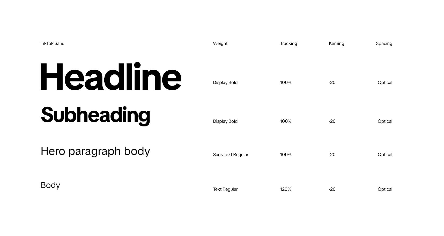
For headlines, the typeface takes on a bold and unapologetic presence, crafted to command attention in both digital and physical spaces. Unlike purely geometric sans-serifs that rely on rigid circles and lines, TikTok Sans leans into a more humanistic construction. This makes the characters feel approachable and dynamic while still holding onto the crispness required for a global technology brand. The slight softness of its forms tempers the bold weight, ensuring that even at large display sizes the type feels inclusive rather than cold or mechanical. When used in headlines, the typography serves as both a structural anchor and a personality driver, making sure that the brand’s voice is not only seen but felt. The clean optical spacing, deliberate kerning, and consistent rhythm across characters give headlines an immediate clarity that scales across formats, from social posts to large-scale event signage. In practice, this means headlines can confidently carry the energy of TikTok without overwhelming the content, striking a balance between expressive storytelling and functional design. This treatment mostly appears on our brand design side rather than in consumer or product use cases.
Taken together, the work around TikTok Sans reflects a broader philosophy I carry into every system I help build: design is not the surface of a brand, it is the infrastructure that allows meaning to travel at scale. A typeface becomes the quiet contract between product, marketing, and community, ensuring that what is said, sold, and shared feels like it comes from the same place. In a platform defined by velocity and reinvention, consistency is not rigidity but a stabilizing force that allows creativity to move faster and farther without losing coherence. From governance frameworks and motion rules to open sourcing and creator toolkits, the goal was always to make the system usable, adoptable, and culturally alive beyond the walls of the company. When the details hold and the voice remains clear across billions of moments, the design has done its job. It disappears into use, and what remains is trust, recognition, and a shared language people can make their own.
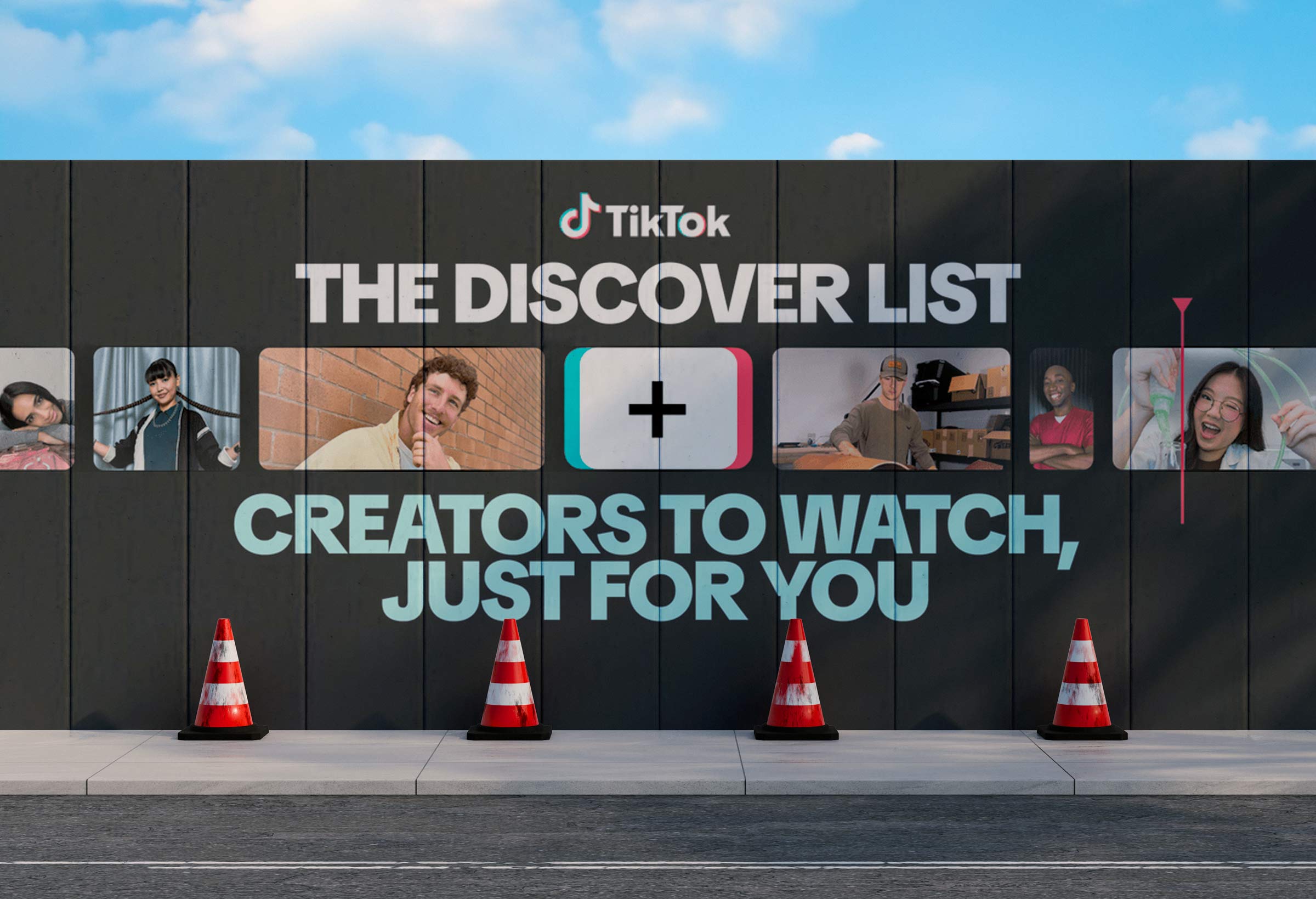
In an app where new terminology is constantly invented, it only made sense to turn to the brand’s vocabulary to set the design tone for the project. This presented the opportunity to take a departure from the original typefaces present in the app and match it more closely with the energy of its creators. TikTok Sans represents our commitment to meaningful innovation, as we continuously aim to improve the user experience by optimizing legibility and reading retention, along with providing multi-language font support for our global community. We wanted to create something in it's own category that would reflect the universality of our app.

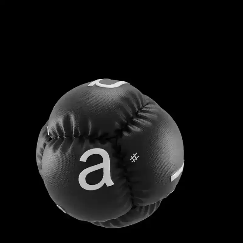
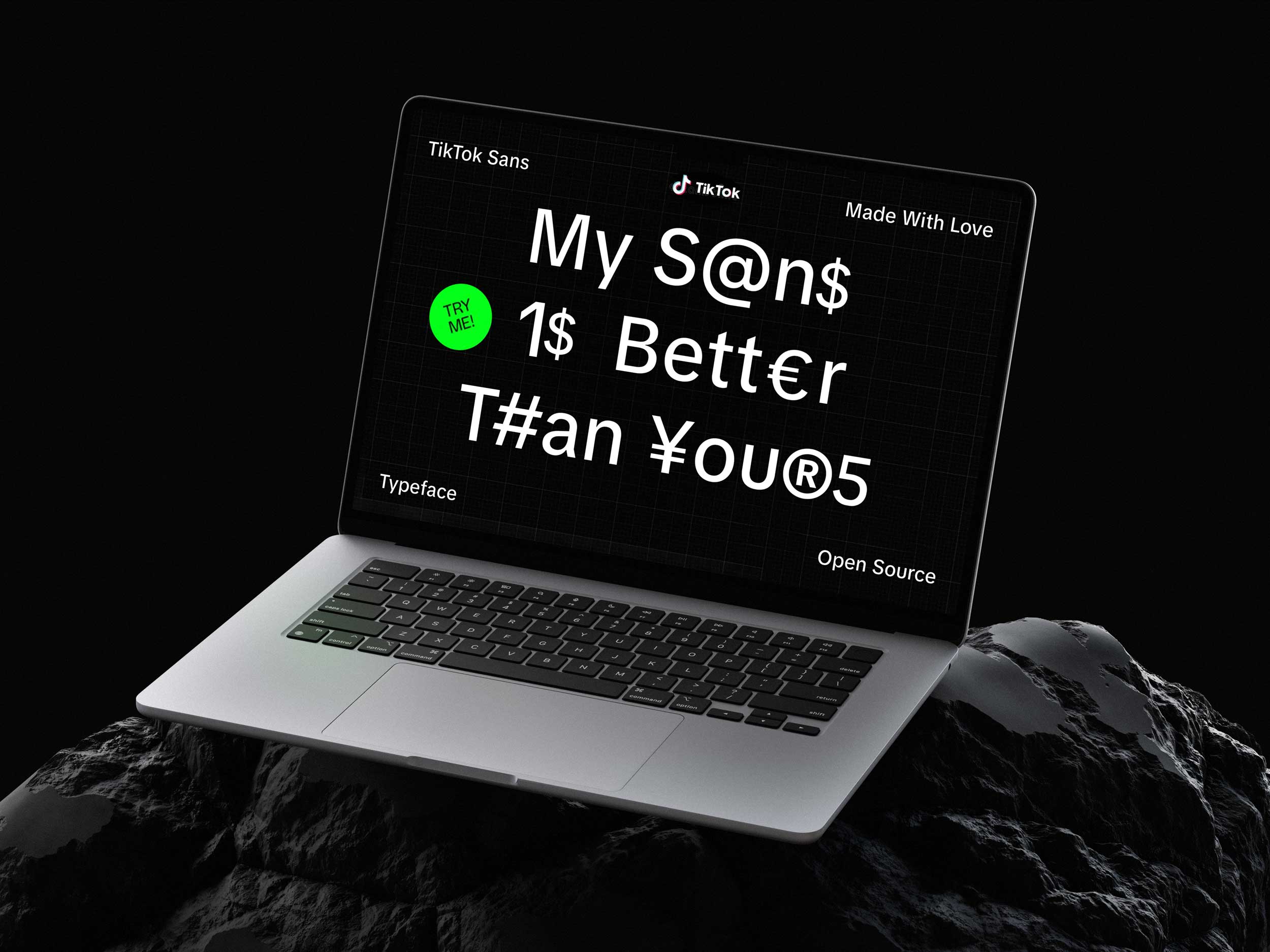
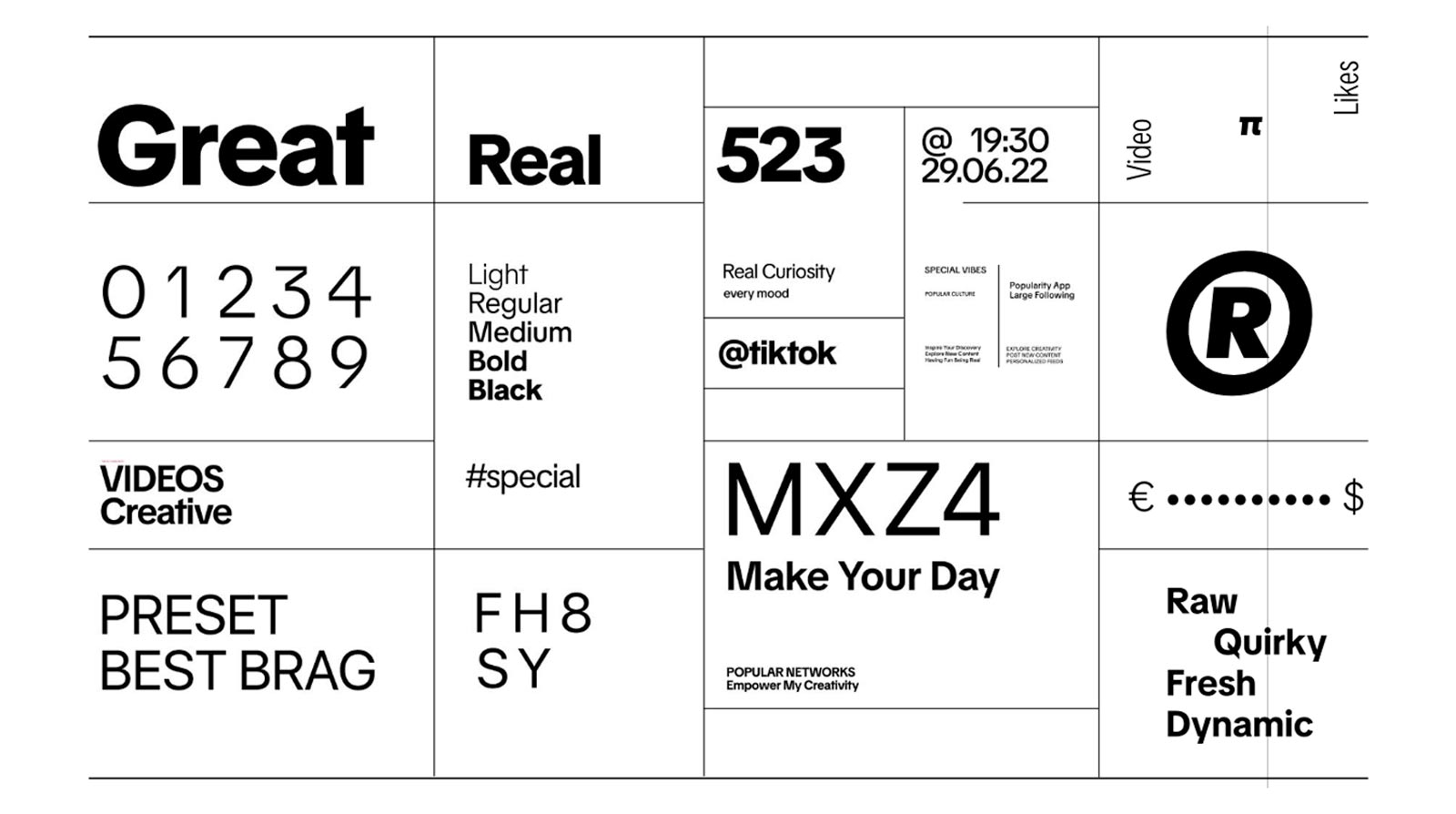
TikTok Sans is what we like to refer to as a Geometric Grotesque typeface that blends the precision of geometric shapes with the approachable functionality of grotesque designs. Positioned between Helvetica's utilitarian balance and Futura's modern minimalism, TikTok Sans is uniquely crafted to embody TikTok’s dynamic brand identity. Grotesques are known for their balanced, utilitarian design with slight quirks, such as uneven stroke widths or subtle inconsistencies in letterforms.

These characteristics lend them a humanistic and functional feel, making them widely used for both body text and display purposes. Geometric sans-serifs are constructed based on pure geometric shapes, such as perfect circles and straight lines. This results in a clean, minimalistic appearance, often perceived as modern but less forgiving for readability at small sizes due to their strict geometry. Taking cues from our original logo and brand book, we were able to use some of the geometry as the foundation here.
.jpeg)
The process of naming TikTok Sans was deeply tied to the platform’s identity, playful, dynamic, and creator-driven. The goal was to develop a name that felt distinct yet intuitive, aligning with TikTok’s mission of inspiring creativity and bringing joy. Early name explorations included terms reflecting content creation, social virality, and community engagement, such as Create, Connect, Vyral, For You, and Talk Sans. While none of these would land, they all have an element of that TikTok personality.

The team aimed for a name that was simple, memorable, and globally consistent, ensuring clarity for all users while avoiding unnecessary complexity in UI surfaces. The guiding principles focused on raw, fresh, and dynamic qualities that captured the essence of TikTok’s brand and its role as a global creative platform. This was a font that would need to be delivered globally and be used in pixel perfect situations from billboards to phone UI and all the weights and elements needed to be right on point.

The naming process followed a structured approach, beginning with open brainstorming and a broad list of potential names. After the initial exploration, the team voted to narrow down the strongest contenders, selecting names that resonated with TikTok’s identity and typographic intent. I was a proponent of pushing the name to be tied to the deep typographical history we were taking part in rather than something that would feel a bit too campy. The name was just the first domino that needed to fall as the full typography system would go on to include templates, motion, layouts and editorial guidelines for art direction and more.

Shortlisted names were then evaluated through localization and external trademark reviews to ensure they were legally viable and culturally appropriate for TikTok’s vast global audience. Considerations included phonetic clarity, ease of localization, and brand alignment, avoiding any unintended negative connotations or confusing interpretations. This was a time consuming process but important, and took place as the core font was being developed and designed as it was our first domino to fall.

A key challenge was balancing uniqueness with brand cohesion. While some initial ideas and options, like TKTK, offered a clever nod to typography and publishing placeholders, concerns over pronunciation and clarity led the team to seek something more universally recognizable. Similarly, the name "Vyral" encapsulated the idea of content spreading rapidly but carried associations with "viruses," making it a less ideal fit, especially after a global pandemic. We wanted something that would be workable for the over 1 billion users of the app and feel timeless and regionless, universal yet approachable. The debate over the name actually took quite a long time to build a consensus.
Ultimately, the team opted for "TikTok Sans", a straightforward yet brand-rooted name that clearly communicated its purpose as the platform’s official typeface. While it lacked the creative flair of some other suggestions, it provided the strongest brand recognition and usability, ensuring that TikTok’s type system remained instantly identifiable and cohesive across all products and touch points while giving a nod to typography history at the same time. We turned typography into a platform, not a file.
.png)
This methodical approach, grounded in creative exploration, brand strategy, and linguistic precision, not only resulted in a functional and recognizable typeface name but also reinforced TikTok's commitment to design excellence. The process reflects TikTok’s broader approach to branding: a balance between user-friendly simplicity and expressive, culture-driven identity, ensuring that TikTok Sans remains a core element of the brand’s visual language for years to come.
.jpeg)
We needed a typeface that works from small screens to large billboards while consistently representing our brand identity and Grilli Type had a wealth of experience in developing bespoke typefaces for leading-edge brands. Their work inherits the technical excellence of Swiss typography but also injects a strong personality into every detail while our internal team ensures the DNA of the platform and the users is maintained. But in order to choose them, we had to go through a thorough proposal process.
TikTok Sans brought clearer strokes, larger openings, and improved readability, making text more legible across different devices and screen sizes. Compared to Proxima Nova, the new typeface is slightly larger, with an increased line height to improve text clarity, particularly on mobile screens. We wanted to ensure that as the app expanded onto new screens that we could evolve it to fit new needs. While the old font worked, the new one gives us a level of control and ownership that was unprecedented before. It was a declaration for our brand and a tool that could work at scale on billboards as well as on phone screens, and this dichotomy was always key for us.
The TikTok Sans typeface development involved a rigorous RFP (Request for Proposal) process, where multiple top-tier type foundries were evaluated to design a custom font that would enhance TikTok’s brand identity, improve product consistency, and reduce long-term licensing costs. The goal was to find a partner who could deliver a unique, scalable, and high-performing typeface that worked seamlessly across interface, branding, and marketing applications while accommodating TikTok’s global audience and multilingual needs. Agencies were assessed based on their ability to meet technical, creative, and scalability requirements, with a strong emphasis on optimizing readability, supporting diverse scripts, and ensuring flexibility across different platforms, including mobile, web, and video content.

The RFP process was highly structured and timeline-driven, starting with agency outreach, NDA execution, and procurement approvals, followed by clarification calls, proposal evaluations, and agency presentations. The evaluation criteria included creative flexibility, technical expertise, and past work with high-profile brands. We knew how thorough our toolkit needed to be, so having worked with brands and clients our size was a key consideration as we chose an agency partner to help bring this font to life.
Over time we got a number of responses which our internal design teams poured over and gave extensive feedback on. Some agencies, such as Dalton Maag, Grilli Type, ABCDinamo, and Colophon, proposed variable font technology for improved rendering across dark and light modes, while others focused on regional language support and cost-effective scalability. Key challenges included balancing expressiveness with functionality, ensuring A/B testing for performance impact, streamlining data visualization and numerals across UI platforms, and planning for future script expansions beyond the initial Latin character set.

Throughout the process, the scoring committee worked closely with procurement teams and product stakeholders to shortlist agencies based on their proposals, presentation insights, and expertise in font engineering. Agencies like Grilli Type and Dalton Maag were particularly strong in their approach to hinting optimization for low-end devices, while ABCDinamo emphasized the importance of a recognizable and expressive typeface that embodies TikTok’s dynamic personality. Considerations around brand distinctiveness, usability, and long-term scalability played a crucial role in decision-making, as TikTok sought a font that would remain timeless yet adaptable to evolving brand and platform needs. While the foundries were all impressive, in terms of the final scorecard, there was a clear winner amongst the group.

Ultimately, the final selection balanced technical precision with creative expression, ensuring that TikTok Sans would serve as a bold, cohesive, and scalable identity for TikTok across all digital touchpoints. The meticulous agency selection and development process reinforced TikTok’s commitment to design excellence and brand innovation, resulting in a typeface that is playful yet functional, expressive yet readable, and distinctly TikTok. Landing on Grilli Type was a huge momentum shift as we began our design process.

Collaborating closely with the winner of our RFP process, Grilli Type, a world-renowned type foundry, I had the opportunity to play a key role in bringing this project to life from our TikTok for Business side along with Crystal Yin and Hamilton Tamayo on our design team. TikTok Sans balances personality with versatility, it’s bold yet approachable, modern yet timeless, mirroring the dynamic essence of our platform. The font became one of the most versatile design deliverables to come out of our studio team in collaboration with our user side team and agency partners. From strategy and considerations around digital and web usage or even coming up with how it would show up on merch were all elements we discussed as we developed a set of typography guidelines as the font was in development for our internal teams to use.
.jpg)
We treated TikTok Sans like a living breathing product, not a file. A versioned repo houses specs, changelogs, and a lightweight RFC template for adding glyphs or features. Rollouts happen behind feature flags with canary cohorts, so we can compare render time on low-end Android devices, crash telemetry, and comprehension scores from in-app reading tests before promoting a build to 100%. Accessibility and trust were engineered in, not layered on. The family was tuned against WCAG contrast guidance in both themes, then stress-tested with dyslexia screens, small-text blur passes, and character-pair audits (Il1, 0OØ, rn/m). A low-vision pack bumps default optical size, unlocks a measured letter-spacing gate for captions, and preserves stroke weight in italics so emphasis never sacrifices legibility. All of these updates are key in font maintainence.
.png)
Typography is the silent architecture of storytelling, and TikTok Sans was designed to give that structure a distinctive, living voice. It needed to capture the same energy and authenticity that define the TikTok community while remaining flexible enough to handle a wide spectrum of use cases. From bold headlines to long-form narratives, from numerals in data sets to captions on mobile, the typeface became the connective tissue that held the brand together across mediums. From print to phone, we wanted it to always look crisp, clean and legible while allowing the flexibility to be adaptable in different contextsand across different mediums.

This adaptability was tested in marketing reports such as Food and Beverage and Financial Services, where TikTok Sans had to deliver both expressive impact and technical precision. It carried insights through hero spreads, guided readers with clear body text, and grounded research in clean, legible data visualizations. Whether presented as interactive PDFs, condensed into social content, or adapted for business decks, the typeface provided a consistent and recognizable voice. In doing so, it proved itself as more than a design asset, becoming a unifying system that allowed TikTok’s identity to move fluidly wherever the brand needed to speak.
The goal was to create a custom typeface that addressed both product and marketing needs, ensuring legibility across platforms such as iOS, Android, Web, TV, social media, and outdoor advertising. The typeface needed to be flexible enough for technical optimization while remaining expressive for branding, with a strong focus on multi-language support, proportional typesetting, and improved readability across interfaces. The system did its job when teams shipped faster with fewer exceptions.

From our roots in entertainment to our mission of fostering inclusivity and self-expression, TikTok Sans complements and elevates the unique experiences our community creates, shares, and discovers every day. By seamlessly enhancing our brand’s visual language across in-app, web, and creative assets, this typeface reaffirms our commitment to empowering creative self-expression on a global scale. At the core, our users were always top of mind in this design process and a key reason that we felt successful.

TikTok Sans operates as a flexible communication system rather than a static typeface, with each weight calibrated to express a different layer of the platform’s voice. Lighter weights carry clarity and accessibility for instructional or product-led messaging, while heavier weights inject confidence, rhythm, and cultural immediacy into campaign moments. This range allows the type system to move fluidly between utility and expression, mirroring the duality of TikTok itself as both a product and a cultural engine. The project unfolded across three distinct phases over a 22 week timeline, beginning with a Concept Phase that focused on creative exploration and defining a clear point of view for what a native TikTok typeface should feel like in motion, on screen, and in culture.
From there, the Design Phase became an exercise in precision and scale, expanding the character set, refining proportions, and pressure testing the system across real product and marketing surfaces to ensure it performed under the demands of a global platform. The final Production Phase translated that intent into a fully operational asset, locking in font weights, spacing, kerning, and technical mastering so the typeface could deploy seamlessly across environments. What sits beyond those initial 22 weeks is just as critical. TikTok Sans continues to evolve as a living system, with ongoing maintenance, iteration, and expansion to support new languages, new formats, and the ever shifting ways the platform communicates with the world.

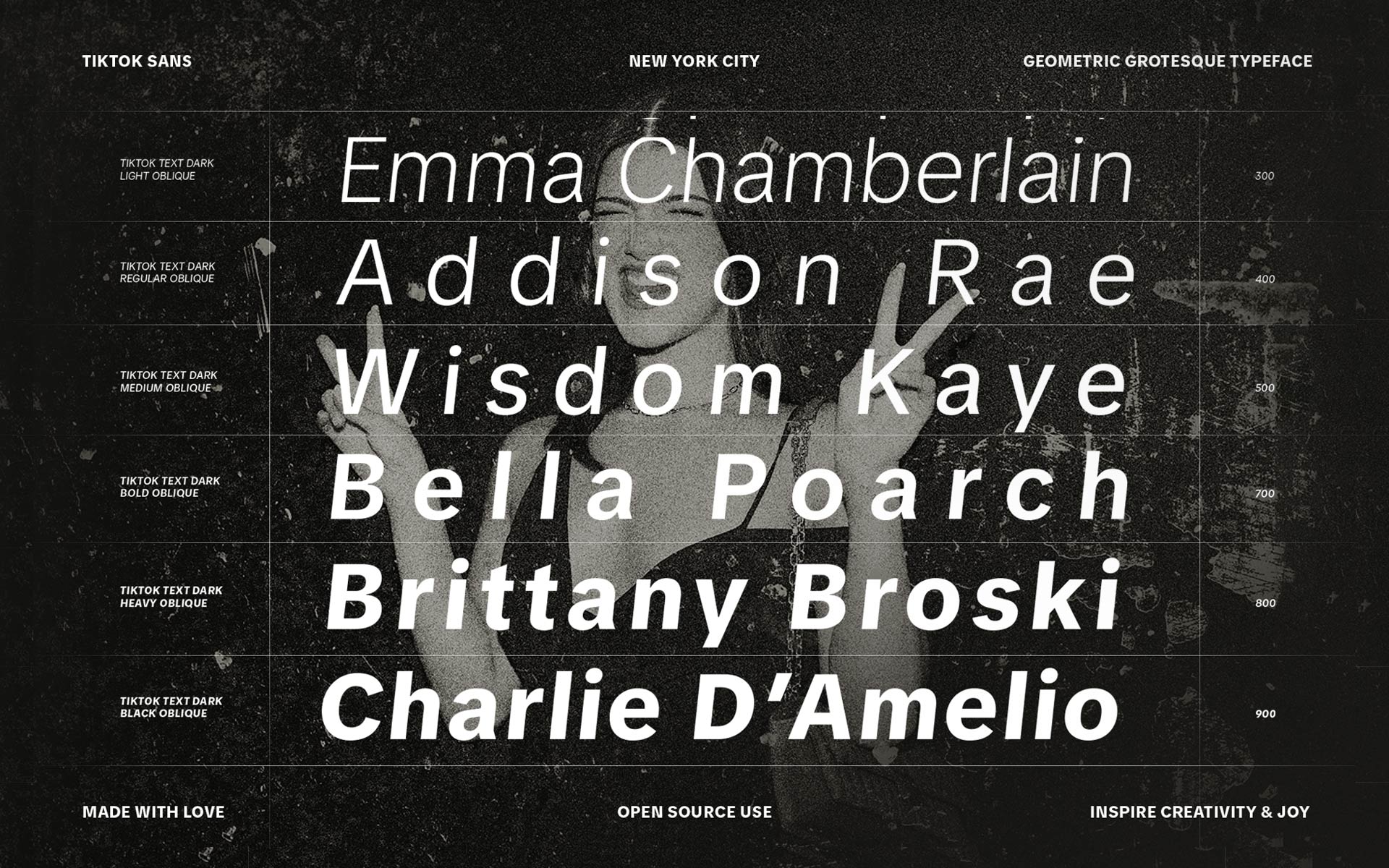
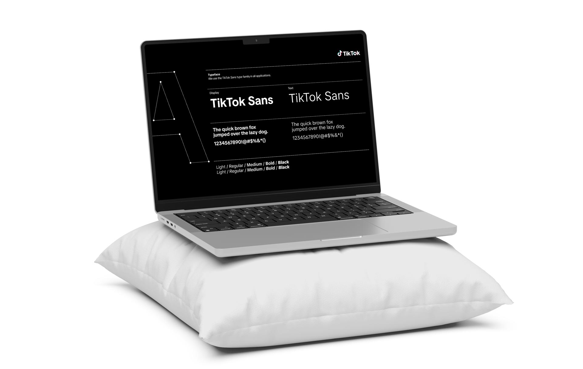
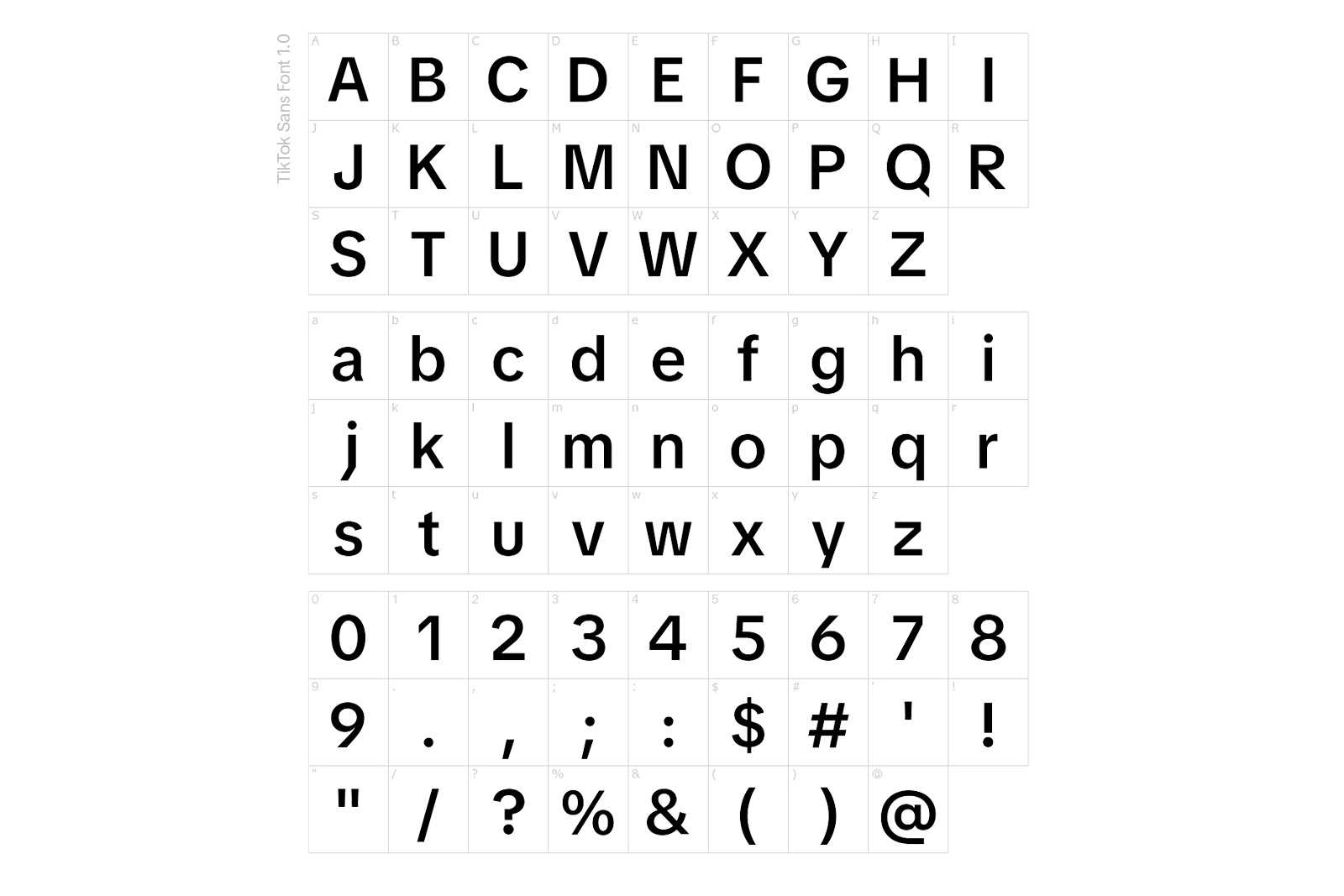
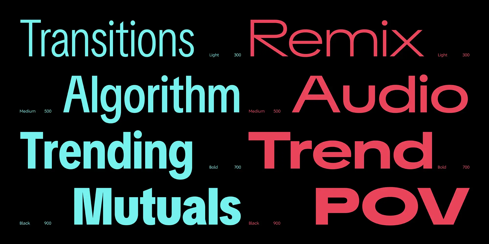
The deliverables included .OTF files for desktop, .WOFF and .TTF for web, and an unlimited global usage license covering desktop, web, app, and broadcast applications. To improve readability and usability, the typeface introduced custom stylistic features, OpenType (OT) enhancements, and an expression gauge for variable font adaptation. Additionally, TikTok Sans replaced conflicting fonts in the web and mobile ecosystem, optimized typography for video readability, and improved performance on low-end devices. TikTok Sans is divided into two subfamilies: Brand, for all of their brand and marketing needs, and Text, optimized for the user interface. The design is expressed across four axes as a variable font: weight, optical size, upright to oblique, and a dark mode axis.

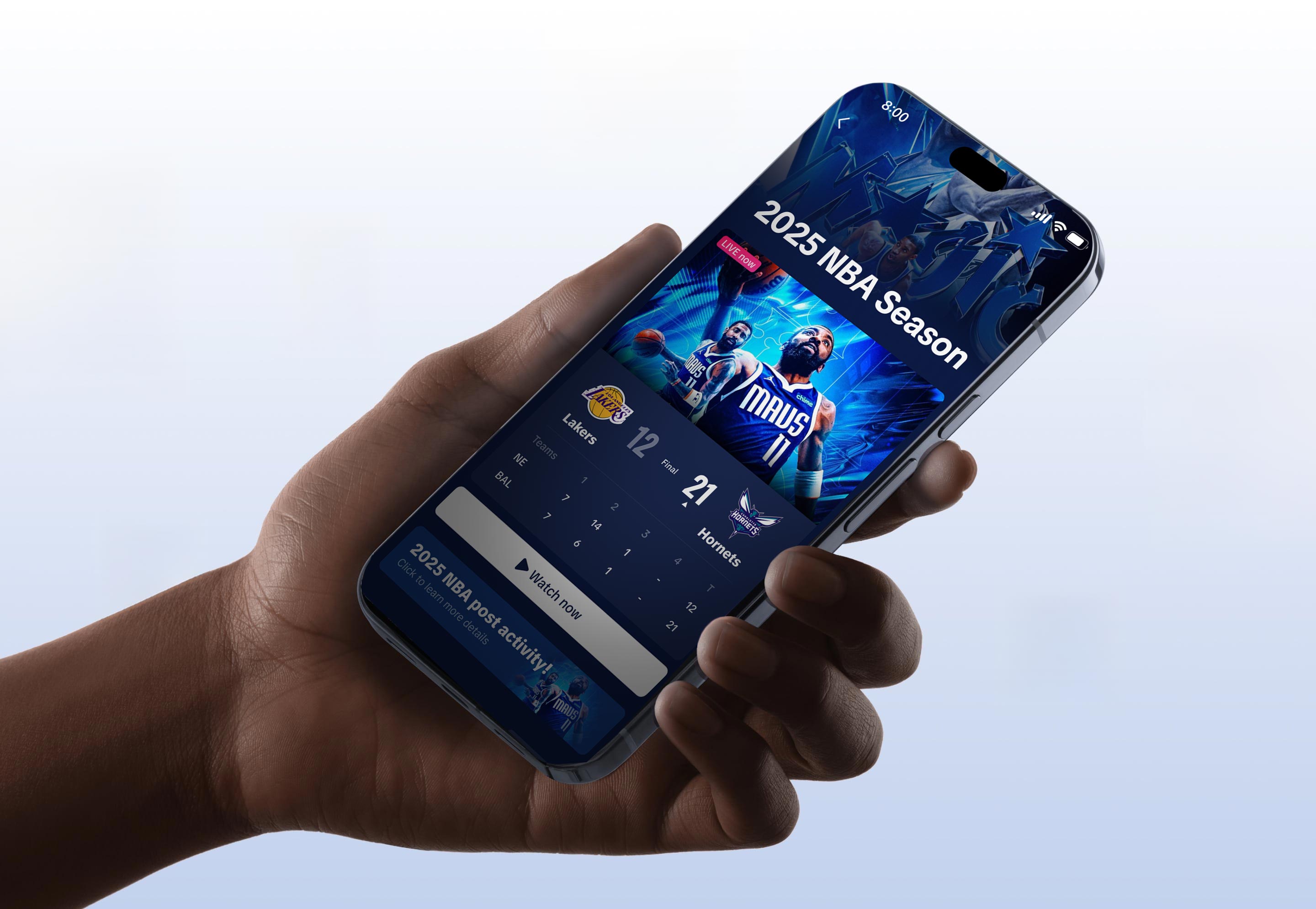
Since TikTok thrives on mobile, every aspect of TikTok Sans was crafted with small screens in mind. The typeface had to be space-efficient yet effortlessly readable, ensuring text remains clear and engaging within the compact UI. To achieve this, the Text version features slim, well-spaced letterforms, striking a balance between legibility and economy. This allows for a clean, structured interface without overwhelming the limited screen real estate, making sure content feels crisp and accessible at a glance.

To further enhance readability, the Text subfamily was fine-tuned with a tall x-height and optical refinements, making in-app text feel fluid and approachable. The optical size axis plays a key role here, dynamically adapting the typeface based on context and screen size. This intelligent typography ensures that TikTok Sans remains sharp, scalable, and effortlessly readable, whether it’s a tiny caption or a bold headline, it delivers a seamless experience tailored for the mobile generation.

As these assets were delivered by Grilli our TikTok For Business design team collaborated with Raisa on our user side to provide feedback on how to utilize these across regions and feel true to many of the features of the platform. We built a comprehensive set of usage guidelines and helped produce launch content as we rolled it out across different mediums. This typeface was one of the largest design deliverables released by our teams and certainly one of the most impactful.
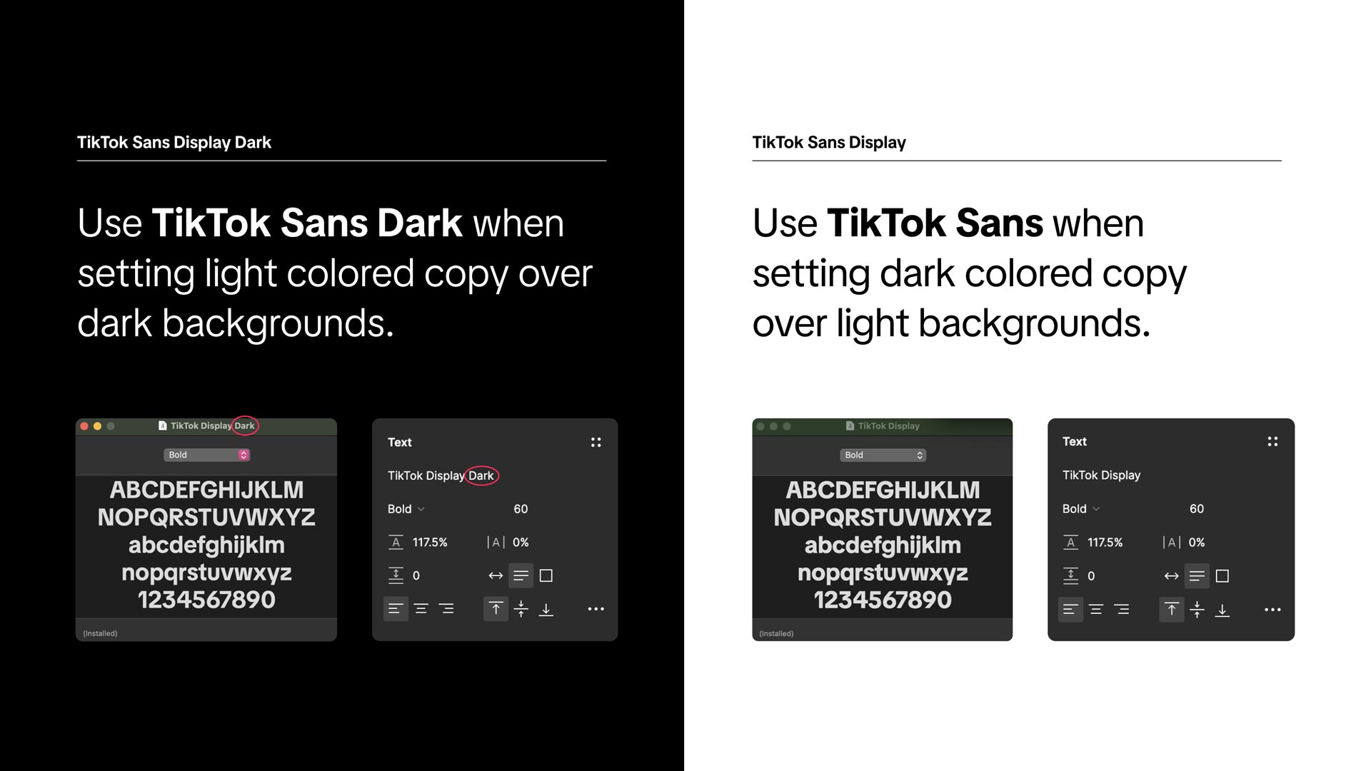
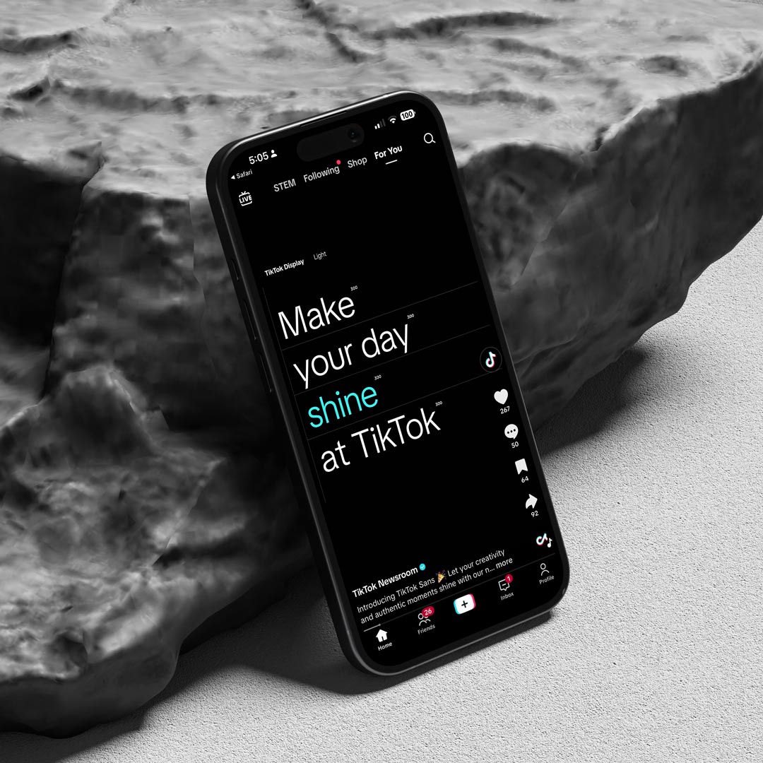
The TikTok Sans system was designed with light and dark variants to maintain clarity, contrast, and consistency across every environment. The dark weight ensures that white or bright text remains legible and elegant on black backgrounds, avoiding the optical thinning that often happens in digital interfaces. Conversely, the standard TikTok Sans maintains a confident, balanced tone on white or lighter surfaces, grounding communication in precision and warmth. This duality allows the brand to express itself fluidly across themes, screens, and moods, adapting to content without losing identity.

TikTok Sans spans a full weight spectrum from Light to Black, offering versatility across different moods and expressions. The optical size axis fine-tunes smaller text for clarity, while allowing larger typography to be bold and dynamic, automatically adjusting to ensure the perfect balance. Whether for tight UI layouts or eye-catching headlines, the typeface adapts effortlessly to the scale and purpose of the design. The payoff was coherence you could feel, not just see.

Beyond static text, upright styles fluidly transition into slanted counterparts, unlocking motion-friendly possibilities for animated marketing campaigns. Dark mode is also thoughtfully optimized, since light text on a dark background tends to appear visually heavier, subtle adjustments refine character weight, ensuring a seamless, visually balanced experience for late-night scrolling sessions. These subtle moments show our attention to detail and understanding of the scale of this type of project.

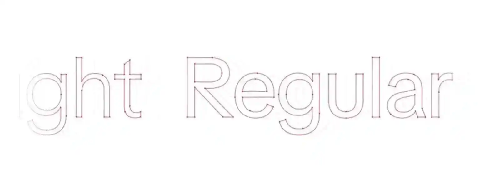
TikTok Sans Display is our primary font – its unique and modern geometric sans characteristics and curves create a dynamic feel. Perfect for communicating and capturing the energy of our brand and our users, which is used for headlines. The secondary font weight is TikTok Sans Text Regular. Its balance makes it suitable for longer instances of text and interface copy. Our bold type can convey expression and energy both in static compositions and motion. We built the rules so creativity could move faster.

TikTok Sans was designed as a variable font across four axes: weight, optical size, upright to oblique, and a dark mode axis. This allows the typeface to adapt seamlessly to different scales and contexts. Starting with the Display font, we focused on embodying TikTok’s energy and identity before optimizing for smaller type sizes. The Text version was tailored for in-app readability, combining tall x-heights, narrow letterforms, and generous spacing for optimal functionality on mobile devices.

To maintain its unique energy, there are four key principles for setting type in TikTok communications. First, all headlines and hero typography should be in sentence case and optically centered on the central axis. This maintains a clean and structured appearance while allowing for fluid readability. Sentence case follows standard grammatical rules for proper capitalization of names, places, and events. However, exceptions are made when capitalization changes the meaning of words (such as in German) or when representing cultural and linguistic nuances for heritage months, slogans, and special announcements. hat’s the difference between a font and a foundation.

Punctuation plays a key role in shaping the tone of TikTok Sans. Headlines do not require a period at the end, keeping them crisp and energetic. However, punctuation can be strategically used when necessary to create a specific rhythm or emphasis, such as separating short sentences for impact. Additionally, when working with hashtags containing multiple words, consistent capitalization should be applied for clarity and readability. This ensures that the typography remains visually engaging without unnecessary clutter.

To develop and cultivate a bold yet organized visual identity, we established the rule that a maximum of two colors should be used per headline. This guideline prevents the design from becoming overly chaotic while still allowing for vibrancy and brand expression. Additionally, leading which is the space between lines, should be kept tight, at or below the height of a lowercase ‘x’ in the typeface. This compact arrangement ensures a cohesive, structured layout without causing overlapping or loss of legibility. These types of guidelines kept the brand consistent throughout the globe and across teams and agencies who had to execute for TikTok.

Finally, TikTok Sans is meticulously kerned for balance, meaning its tracking and spacing should always remain at the default optical setting of ‘0’. This ensures consistency across different applications, keeping the type smooth and intentional in its design. These principles together define TikTok Sans as a font that is both functional and expressive, reinforcing the brand’s distinct personality while providing a strong visual foundation for all TikTok communications.
Typography, to me, has always felt closer to a street than a system. You wander into it thinking you’re looking for a sign, a menu, a wayfinding arrow, and suddenly you’re reading a city’s psyche in the curves of an R or the stubborn spine of a lowercase t. Every place has its vernacular. Hand-painted shop fronts in Queens, vinyl awnings sun-faded in Mumbai, the quiet authority of a subway map that has guided millions through chaos without ever raising its voice. Working on TikTok Sans carried that same hum of lived language. It wasn’t about drawing pretty letters in a vacuum, it was about distilling the cadence of a billion inside jokes, late-night captions, and punchlines that land in six words or less. The goal was a typeface that could sit comfortably in the feed at 2 a.m., whispering clarity to someone half-asleep, then turn around and hold its own on a stadium ribbon board screaming the score to 80,000 fans. Good type doesn’t announce itself. It behaves. It earns trust the way a great neighborhood spot does, by showing up consistently, by knowing when to step back, by understanding that the experience belongs to the people using it. If I’ve done my job right, the letters disappear into the rhythm of daily life, carrying culture forward without anyone needing to ask who set the type.
TikTok Sans is more than just a typeface, it embodies the way language evolves on TikTok as a platform and cultural force. TikTok has reshaped the way people communicate, introducing a fast-paced, visually engaging, and highly interactive form of expression where text is as much a part of the storytelling as the video itself. From viral catchphrases and remixed slang to the rise of new internet dialects, the platform has accelerated linguistic shifts and influenced the English language in profound ways.

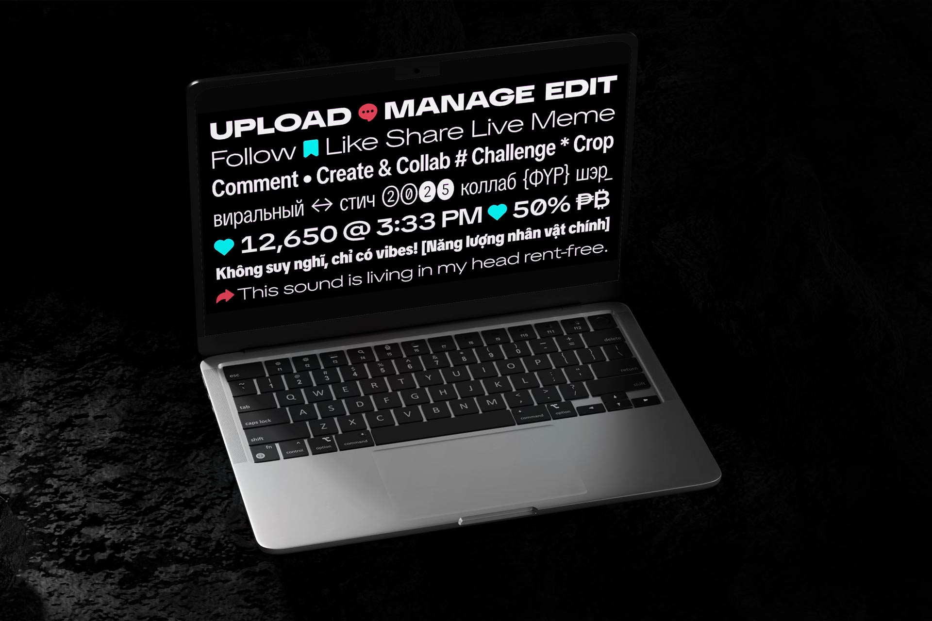
Phrases like “It’s giving,” “No cap,” and “POV” to name a few have transcended digital spaces, embedding themselves into everyday conversations. The way text appears on screen, whether through subtitles, captions, or typography-driven trends, plays a crucial role in how humor, irony, and emotional nuance are conveyed. TikTok Sans was designed to capture this dynamism, ensuring that the platform’s distinct mix of playfulness and clarity is reflected in its visual identity. As a medium that thrives on user creativity and rapid cultural exchange, TikTok has blurred the lines between speech and text, making typography a key player in shaping modern digital discourse regardless of the language or region of origination. Slang and internet speak was a key consideration as well as language and regionality.

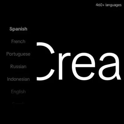
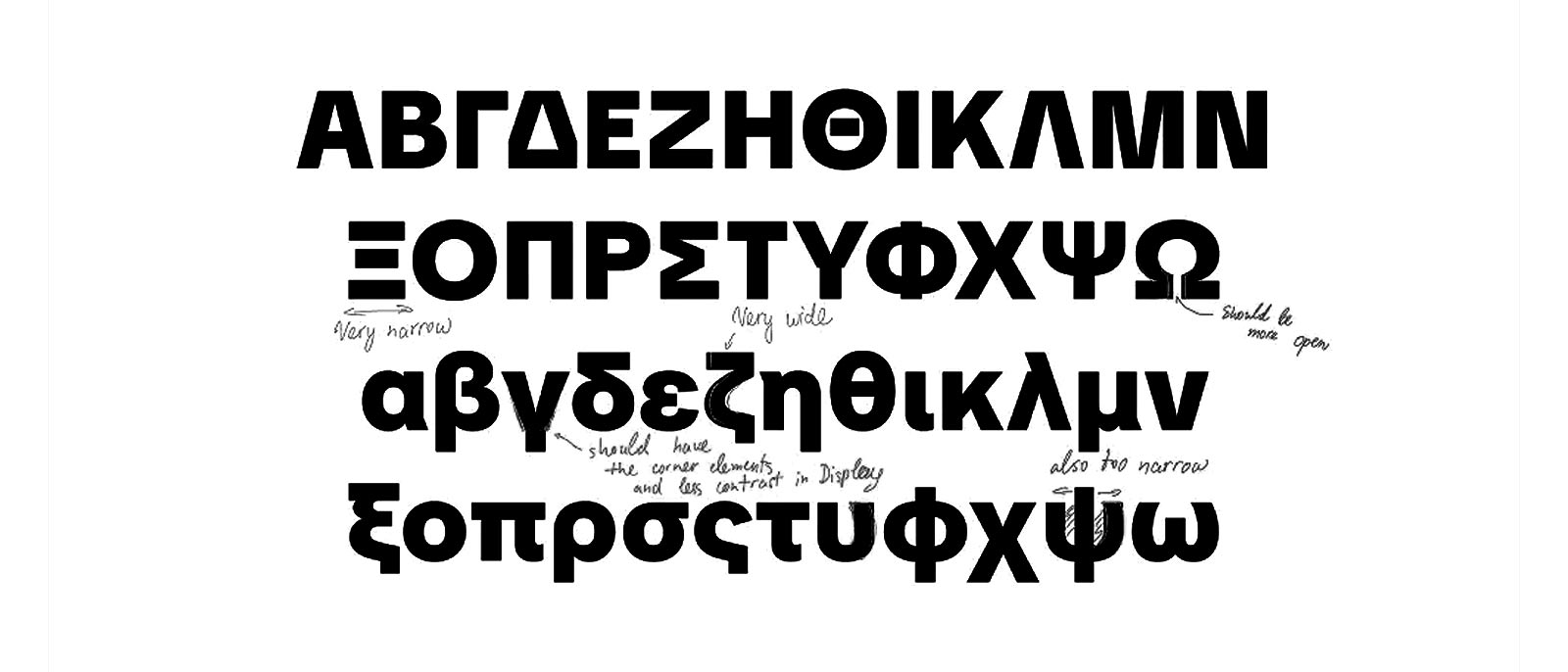
To support TikTok’s global audience, the typeface was designed with 576 language scripts across Latin, Cyrillic, and Greek. Each script was crafted with input from native type designers, ensuring cultural and visual harmony it supports various languages including English, Spanish, Portuguese, French, German, Italian, Indonesian, Turkish, Vietnamese to start, with plans to add more in the future. This was a deeply involved process and required global collaboration across all our regions and teams.

Before TikTok Sans, language support across the platform functioned more like a patchwork than a unified system, with different fonts handling different scripts, markets, and surfaces in ways that subtly fractured the brand voice. Latin, Cyrillic, and regional character sets often behaved inconsistently across product UI, marketing, and broadcast environments, creating edge cases in readability, spacing, and tone that became more pronounced as TikTok expanded into new markets. Each localization effort required workarounds, substitutions, or compromises that diluted typographic coherence and slowed global rollouts. The challenge was not only technical but cultural: how to ensure that a caption in Spanish, a dashboard in German, or a campaign in Indonesian felt like it came from the same platform, not a translated approximation of it. By designing TikTok Sans as a truly global type system, we married linguistic precision with visual consistency, creating a family engineered to support hundreds of languages while preserving rhythm, legibility, and brand character.

Native input from regional experts ensured scripts were not merely ported but harmonized, respecting local typographic traditions while aligning with TikTok’s visual DNA. After launch, this unified system allowed teams to scale into new regions with confidence, knowing the typography would hold across languages, devices, and cultural contexts. The result was a platform that speaks in many tongues yet sounds unmistakably like itself, reinforcing trust, accessibility, and belonging for a truly global community. By marrying expressive personality with practical functionality, TikTok Sans demonstrates that even in a fast-paced app where everything is always moving, typography can be bold, memorable, and seamlessly integrated. I’m incredibly proud to have contributed to this project, ensuring TikTok’s typeface matches its ambition: to be the global home for discovery, self-expression, and joy. With our entire global team contributing to the feedback and development process this just became a massive undertaking.

TikTok Sans combines playful, quirky details with simplified shapes to create an approachable yet tech-forward tone. Distinctive elements like the straight-lined ‘a’ terminal, the sharp descender of the ‘j,’ and the unconventional tail on the ‘Q’ give it character, while simplified shapes, like the stemless ‘u’ and spur-less ‘G’ keep it clean and functional. Recognizing TikTok’s late-night appeal, we optimized the Text subfamily for dark mode, ensuring that light-on-dark text retains perfect visual balance.

Designed to protect and represent the diversity of our global community, our new typeface is designed with accessibility in mind, supporting numerous global scripts and equipped with an anti-spoofing safety and security features. We aim to build responsibly and remain dedicated to upholding transparency and ensuring the safety of our community and we remain committed to exploring new ways to enrich the TikTok experience, taking into account feedback from our global community.

To refine the user experience based on real-world feedback, TikTok Sans was gradually rolled out to select creators before an official announcement. This allowed the platform to test the typeface in various content environments and optimize its performance before full implementation. With TikTok Sans now replacing all previous fonts across the platform, TikTok remains committed to ongoing improvements based on community feedback, ensuring that the typeface continues to evolve alongside the platform’s global audience and accessibility initiatives. The craft compounded into something bigger than any single campaign, and this is commitment to the craft and design.

When an app is part of someone's daily rhythm, even a subtle design change can feel like a shift in muscle memory, like reaching for a light switch that’s suddenly a few inches to the left. At first, it feels unfamiliar, but with time, it becomes second nature. A new typeface reshapes the visual experience, and while it may stand out at first, it’s designed to integrate seamlessly into the way people navigate and engage with the app. Type can carry presence, even across distance. That’s the bar when the audience is the world.
.webp)
It took users some time to adjust to the new look and feel but over time the typeface became ubiquitous. This effort was a real call and response between our users and a robust team of internal folks, this couldn't be done without the help of so many of these cross functional moving parts and it was my pleasure to be a part of this herculean effort.

Typography isn’t just about readability, it’s a core part of a brand’s identity. TikTok Sans was created to blend expressive branding with a dynamic, personality-driven UI, proving that a typeface can be both functional and full of character. We’ve come to expect sterile, predictable interfaces, but TikTok is built on creativity, why should its typography be any less bold? This is why TikTok Sans is as bold and brash as it is, while still being clear and legible to get a message across. We gave the internet a voice it could actually use.
As adoption scaled, the work entered a second phase that was less about aesthetics and more about industrializing the type system for global, open-source use. After the initial launch with Grilli Type unified TikTok’s typographic voice, we partnered with Type Network and Contrast Foundry to expand the family’s technical range while preserving its character. This phase introduced a true width axis to accommodate dense UI constraints like buttons, CTAs, and fine print, using a sparse-masters strategy that expanded capability without inflating file size. This second phase was a planned iterative part of the launch plan for as large a font project like this as we were tackling.
Scripted slant forms were refined through a hybrid approach of generated and manually drawn glyphs to improve motion quality, while native Greek and Cyrillic were optically harmonized with the Latin set. Hinting and rendering were tuned for low-resolution and low-end devices, aligning strokes to pixel grids to prevent blur at small sizes. By releasing the final variable family on Google Fonts, we moved the work from proprietary infrastructure to shared global resource, enabling frictionless adoption, community contribution, and long-term sustainability beyond the boundaries of the TikTok platform. This wasn’t branding, it was operational clarity.

TikTok’s verbal and typographic identity is bold, expressive, and deeply connected to its global community. Every word, every interaction, and every moment on the platform carries a unique energy one that needed to be reflected in its typography. TikTok Sans was designed to embody this distinct voice, translating the brand’s dynamic, inclusive, and inventive personality into letterforms that feel uniquely TikTok. I was able to help build out the set of guidelines that our entire design org continues to build upon.
.png)
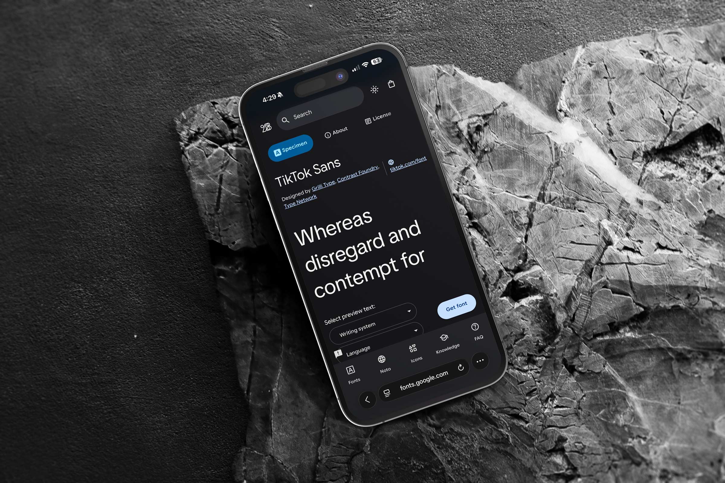
Over time as we had loftier goals of expantion, Type Network partnered with our TikTok internal design team to evolve TikTok Sans from a brand face into a robust variable family that serves product and marketing with equal reliability. The goal was simple and ambitious at once: keep the voice clear and playful while giving teams a type system that scales across screens, regions, and use cases. The family is now open source on Google Fonts so anyone can use it and learn from it.

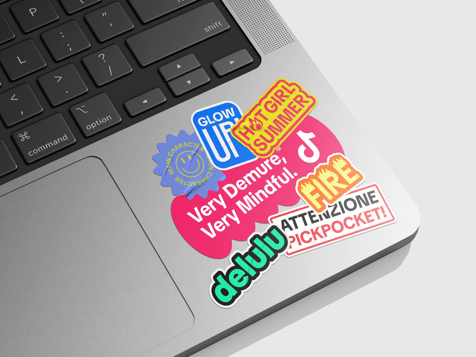
We also built a sticker-style typographic pack in TikTok Sans that turns community vernacular into expressive, modular badges for posts, streams, and event toolkits. Our summer interns Cassidy Cho and Kristine Xie sourced the terms and drafted early comps, Joy Seet and Crystal Yin refined hierarchy, outlines, tilt, and shadow treatments, and I design directed the system from concept to production. We standardized baselines, stroke weights, and color tokens so assets scale cleanly from tiny UI overlays to bold motion frames. Each unit stress tested the variable axes for legibility and punch, and the pack shipped as a flexible digital library with animated and static variants that teams can drop into campaigns in seconds. These stickers were one of the most joyful expressions of typography that our design team got to build in this TikTok Sans rollout.
A major priority in the typeface’s evolution was ensuring clarity without sacrificing character. TikTok is a mobile-first platform, where text must be compact yet readable within the narrow constraints of a phone screen. The optical size axis in TikTok Sans makes this effortless, adjusting letterforms dynamically based on size and context. Whether a comment, a caption, or a bold call-to-action, the typeface adapts fluidly, making sure every word lands with impact.

As I mentioned above, TikTok Sans is now open source, which means the same expressive type you see across the app is free for everyone to use in brand work, products, and motion. Releasing it openly turns a platform voice into a shared design resource, so creators, developers, and educators can build with the exact letterforms that shape modern culture. Variable axes let the font stretch from light to bold and narrow to expanded, keeping clarity on screens of every size while staying playful at heart, something we wanted the world to suprise and delight us with and truly embrace creativity as a two way street. The work only mattered if it held up in the wild.
.jpg)
Type is not decoration for me. It is product. The way a word lands on a screen shapes how people read, trust, and act. When I design a type family I am designing pacing, tone, and permission. The goal is a voice that can be quiet for instructions, loud for headlines, and effortless in the spaces between. Working with folks like Crystal and Raisa and the talented team at Grilli, I met so many other brilliant design and creative minds who feel the same way. That allowed us to give this font a true attention to detail like no other.
I like to anchor the work in typographic lineage. Grotesque for utility, geometric for precision, humanist for warmth. Then I strip away what is trendy and keep what helps people read faster and feel more confident. Counters open up, joins get cleaned, and rhythm becomes the real brand asset. For TikTok Sans, the history lives with the modernity and as we released it to the world, we got to see the real time reaction and evolution of this typeface as well over time.
The craft is in the boring parts. Numerals that align in tables. Punctuation that sits in the grid without drifting. Kerning pairs that never call attention to themselves. I redraw problem letters, test them in paragraphs, then test again in captions and UI labels. The family earns trust by behaving well in the places no one is looking. TikTok Sans really was one of the most impactful projects I had a chance to work on during my time at the company, and the reverence for the craft of design was something that came through for me.
The biggest learning from this launch was the importance of systems and process on such a large scale collaboration. There are so many moving parts that you have to keep in perfect lockstep and alignment and that is very difficult. Process matters as much as taste. Early builds go into real products behind flags. We measure comprehension, tap targets, and render time on low end devices. If a decision does not improve one of those, it does not ship. Variable axes are chosen the same way. Weight and optical size are non negotiable. Width is added only when the interface proves it needs it. Slant is tuned for motion so emphasis reads cleanly in video.
Beyond this, we also had to think dynamically so that we could premtively solve issues our users would encounter in the wild. Adoption is design too. Engineers get tokens for weight, width, optical size, and slant. Writers get guidance for tone and casing. Editors get motion rules so type animates without wobble. Accessibility is built in from the start with clear figure sets, tabular options, and language support that respects the readers who use it every day. This is what future proofs our font as it is out in the real world.
.webp)
I like releasing great tools into the world. When a brand font becomes open source, the work stops being a costume and becomes a contribution. Students can study it, small teams can ship with it, and the community can help it grow. That is the kind of legacy I want for any type project I lead. For TikTok Sans, to have my fingerprints on such a widely used typeface that is now free for anyone to use is something that is extremely fulfilling and in many ways a dream come true. A platform for discovery, where the type itself becomes the interface through which new voices, ideas, and stories are encountered. Its clarity and flexibility allow content to surface effortlessly, guiding attention without friction and giving emerging narratives the space to be seen, read, and shared. In this way, the typeface does more than communicate, it enables discovery at scale, shaping how information is found and experienced in the wild.

A typeface takes on a completely different meaning once it leaves the controlled environment of a brand system and enters the world at scale. In that moment, it stops being just a design deliverable and becomes part of everyday visual language, something people read, interact with, and subconsciously internalize across contexts you can’t fully predict. The legacy of a font is not defined by how it looks in a presentation, but by how it behaves in the wild, across interfaces, cultures, languages, and moments of use that extend far beyond its original intent. When a typeface reaches that level of adoption, it begins to shape tone, perception, and even how information is processed, influencing everything from clarity and trust to emotion and identity. It becomes infrastructure, quietly supporting communication at massive scale while rarely calling attention to itself. That is what separates a brand font from a true system typeface, its ability to transcend a single identity and become a flexible, durable tool that others build upon. There is also a certain permanence to it, because once a typeface is widely adopted, it leaves an imprint on the visual culture of its time. It becomes associated not just with a company, but with an era, a behavior shift, or a way of interacting with technology. Designing or contributing to something like that carries a different level of responsibility, knowing that the work will live on in ways that extend far beyond the original brief.
Bringing it to life took a coalition of makers. TikTok Design led the vision and stewardship. Grilli Type helped craft and refine the family. Channel Creative supported the identity and storytelling around the release. CoFo contributed type expertise and production craft. Type Network handled quality control and distribution guidance, and the family is available on Google Fonts for effortless adoption. Together they turned a proprietary system into a public good, built to scale from web to app to broadcast with one consistent voice. I was grateful to play a meaningful role in that coalition, giving feedback and providing design direction and developing large elements of this toolkit was a transofmrative experience. We designed for reality, not for the keynote or presentation deck inside a meeting room, and I think you can feel that in the final result.
Open sourcing TikTok Sans was not a marketing stunt, it was a strategic move that extended the brand’s voice into the broader creative ecosystem. TikTok is where culture is made and remixed, so making the type accessible lets creators and designers speak in the same visual language the platform uses. It also positions TikTok as a contributor to the design community, not only a platform extracting value from it. By releasing the font publicly, we enabled educators, students, indie creators, and small brands to build with a professional grade typographic system without cost barriers. That choice reinforces a creator first narrative in a way that feels tangible, because it gives people an actual tool, not a slogan. It also increases consistency across the internet, since TikTok related storytelling can use the same typographic DNA beyond the app. From a brand standpoint, this turns typography into cultural infrastructure, a recognizable voice that travels through decks, keynotes, classrooms, and creator projects.

To spark creator adoption, we also released a vertical-first kit: editable caption cards, lower-thirds, timer overlays, and karaoke-style lyric templates. Motion presets that honor the slant axis to eliminate optical wobble when animating type were delivered as well, making the switch effortless for editors and creators who live inside short-form video. And it was this knowledge of what it took to create TikToks that made the development of this font so integrated into that creative process.

Beyond functionality, TikTok Sans had to reflect the platform’s global, expressive, and ever-evolving culture. The typeface expands multi-language support, ensuring that TikTok remains inclusive across diverse regions. The introduction of SemiBold and ExtraBold weights amplifies the brand’s expressive range, adding playfulness and emotion to its typographic voice. The slant axis further enhances this, allowing text to seamlessly shift into motion, unlocking new potential for animated content and storytelling.
.png)
Typography forms the bedrock of a brand’s visual identity, and TikTok Sans was imagined as far more than a functional font. It was envisioned as a connective system, a living architecture of form and rhythm that could stretch across the entire spectrum of TikTok’s world, from the intimacy of in-app interfaces to the scale of global brand campaigns. In shaping its direction, I carried the responsibility of giving visual language to the platform’s mission to inspire creativity and bring joy, translating that spirit into a typographic voice that felt both timeless and attuned to the boundless energy of our community. The details aren’t decoration, they’re product and that’s how you ship at global scale.

TikTok Sans was the moment we stopped treating type as a borrowed accessory and started treating it like a core platform primitive, something as essential as color, motion, and layout rules. The missing piece was not drawing the letters, it was designing adoption, because at TikTok scale the best craft fails if it cannot move through hundreds of teams, pipelines, and vendors without friction. I helped convert a creative ambition into an operational rollout by defining where the font would live first, what it would replace, and how we would measure success across product, marketing, and revenue surfaces. In the end, TikTok Sans did what great design systems do: it disappeared into daily use while quietly raising the quality bar for how culture is written, read, and shared at internet speed.

TikTok Sans ultimately became the clearest proof point that TikTok was done borrowing its voice and ready to define it. What started as a typography project evolved into a unifying move that made the brand feel more intentional, more confident, and more itself across every place it shows up. The real win was coherence: the same energy that lives in the feed could now live in product, marketing, events, and business storytelling without the signal getting diluted. It gave the platform a visual cadence that audiences can feel even when they are not consciously reading it, like a familiar accent that makes everything sound native. It also marked a shift in maturity, where design is not treated as polish but as identity building infrastructure that scales with the company.
TikTok Sans helped turn speed into something that still feels crafted, giving teams freedom to move fast without losing consistency or taste. By making the typeface open and available beyond the app, we extended that voice into the wider creative world and let the community speak back in the same language. In that sense, the font became less about letters and more about belonging, a shared visual vocabulary for a global culture machine. And that is the point: when typography is done right at this scale, it does not shout for credit, it quietly makes everything else feel inevitable.
.jpeg)
Key Collaborators: Jinglu Li, Ryan Northway, Ye Lin, Fernando Wang, Yujie Li, Peijun Guo, Qinyi Yao, Eason Shen, Jessie Ning, Jerio, Alex Ng, Mercy Tee, Haoqi Wen, Shayna Wenger, Raisa Janjua, Julia Zhou, Ian Alexander, Johnny Chiu, Hamilton Tamayo, Crystal Yin, Chang Ma, Jialu Li, Eason Shen, Thomas Cheng, Lachlan Bradford, Guandong Li, Yunfeng He, Tiantuo You, Haoyu Wang, Jun Shen, Haohao Duan, Melon Lee, Yuhang Liu, Miaomiao Liu, Xiangyu Kong, Yixia Xu, Kristin Peak, Nilesh Patel, Belle Baldoza, Jenny Westin, Parris Pierce, Alex Polo, Mike Hinson, Joy Seet, David Jonathan, Ross Guido Ferreyra, Maria Doreuli, Krista Radoeva
Tools: Adobe Creative Suite, WebGL, Figma
Deliverables: Typography Brand Guidelines, Font Files, Marketing Assets